Website Design Checklist for Small Business Owners. Part II
In Part I, we discussed how business owners can benefit by looking at their websites as Digital Stores and plan features accordingly, as well as getting quality pictures and written content ready.
You will find Part I and III here. Web Design Checklist
Part II –Formatting Content and Updating
What are the points you may like to keep in mind when you are getting your website designed by someone? In this part, we will look mainly at formatting content.
Colors and Gradients – How to choose many colors?
What color schemes do you prefer? Matching different colors requires aesthetic insight and attention to finer points. This is where your individual taste can play a role. Many themes come with two colors. Sites like colorhexa can help to choose more shades that go together.
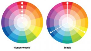
Let’s suppose, your main theme color is orange, and green is the natural pair color. Now you may like to add more color variety and depth without making your site a mishmash of uneven colors. To that end, you can choose from monochromatic variations (shades, tints, etc) of orange, which is your primary color.
First, you need to open Colorhexa.com and type in ‘orange’ at the top search box. You’ll find monochromatic variations at the bottom of the screen here, which will go with orange. It is however more difficult to get matching colors from schemes like Complementary Colors, Triadic Colors, etc. These are all arrived at, kind of mathematically. You can avoid these. You try homogeneous colors instead.

Search “Nature Inspired Color Schemes” instead and you’ll find many options.
How do you easily communicate with someone about a particular color? Search “hex code from image” and you’ll fund a number of sites. You need to upload a screenshot or image having the color. Click on the color in the image after uploading it. The website will display the color hex code, which you can email or SMS. Website Themes accept hex codes.
How & Why Crop Pictures?
First, Why? In e-Commerce & Catalog websites products and services are almost always displayed in a list view with pictures. When you click on a picture you are taken to a single product page with a bigger picture of the product. Normally you cannot upload a different picture for the list view and single product page view. Firstly, a designer should display both images in the same aspect ratio like 4:3, which I use very often. Why? A different aspect ratio will hide a portion of the picture on the side, displaying a cropped product.
Aspect Ratio: Now, in websites, you need to define the picture sizes not in terms of the aspect ratio but in terms of width and height. First, let convert 4:3 aspect ratio to decimal. So we divide 4 by 3 which gets us 1.33. The following is an example.

As you can see in the table above, you can have different sizes with the same aspect ratio. On your website, your designer will be defining different sizes for different views. If the Aspect Ratio is the same them there will be no partial image display. So, keep the aspect ratio the same for all product views.
Size: Remember you are allowed to upload only one Featured or Main Image. So, what size are you going to choose 360 by 270 (smaller) or 600 by 450 (bigger)? The bigger one of course, otherwise resolution in the Single Product page will suffer.
So, now you are able to use the same image for multiple views displaying the product end to end.
Cropping & Tools: In the next step we need to crop images to the same aspect ratio so that, on the website, you will see exactly the same image you have with you. Not a half displayed product or person’s image. You can also use online tools like fotor.com etc. Some sites allow you to crop images in bulk.
For images of people, you may like to use for 4:3 with portrait orientation, an option which you will find in the MS Picture Manager tool. Another point I would like you to note is that the discussion here about aspect ratio is in relation to cropping of images. In relation to a Digital Camera, it can have a different meaning.
Do I also need to Resize & Compress?
Next, you need to resize the image. Why? We have only cropped the image. But the size may still be very big. The above-mentioned tool and online sites will let to do all this and more. Now in case of some images, if you resize exactly to 600 by 450 the resolution may not be satisfactory. So, you select a slightly bigger size. You need not worry. Since you have the same aspect ratio site-wide, the complete image will be displayed end to end.
Bad pictures downgrade a site. When building an average website with a CMS, we spend more time selecting, cropping, resizing images than the rest of the activity. This is why I am putting in so many words to describe the issue.
Finally, you need you to compress the picture using possibly an online compression tool like compresjpg.com, etc. Reducing the picture size, usually reduces the file size also, however this may not be enough.
What Fonts can I use?
Most themes use fonts that are available in Web Browsers, so fonts don’t need to download from your website. Alternatively, you can use Google Font to make your text look different. But it can spoil your loading time by about 300 milliseconds. We will talk more about loading time in the next Part III of this article.
Do I need an Admin Panel?
There many reasons why an admin panel is more than an added convenience. It’s not uncommon for many to forget about the website for long periods and as a result, the contents do not feature the latest info about your business. Owners also forget to renew the maintenance contract with their web designer. And then lethargy creeps in. If you have an Admin Panel you are not dependent on the designer and you can keep updating. Fresh content means better ranking in search engines besides other things.


